Your chance to vote on a name for the SF Live show!

hey guys,
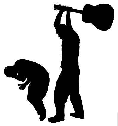
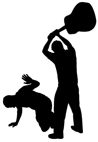
In the course of designing the new poster and t-shirts, I came up with these silhouette logos to update the current Songfight! gif. Which do you like better? The first is more true to the old gif, but the second might look better. Or do you prefer the old line drawing? This is for everyone to comment on, but I specifically want to know what Spud and JB think.
http://www.c-hack.com/songfight_design/logo1.gif
http://www.c-hack.com/songfight_design/logo2.gif
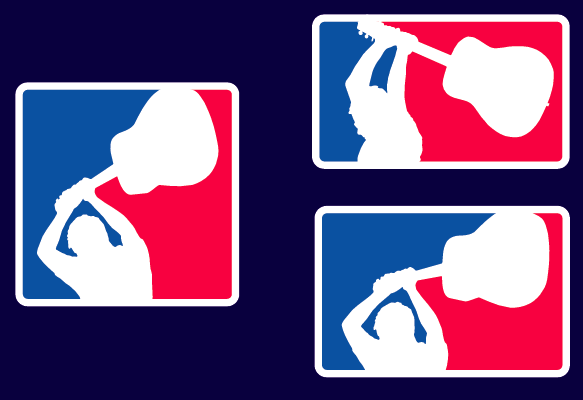
and depending on which one you like best, it might be a factor in the sports logo design, if we go with that as part of the t-shirt this year:
http://www.c-hack.com/songfight_design/logo-sports.gif
Also, I realize as I'm typing this that I forgot the trumpet and the broken string. I can always add those in if you want.
In the course of designing the new poster and t-shirts, I came up with these silhouette logos to update the current Songfight! gif. Which do you like better? The first is more true to the old gif, but the second might look better. Or do you prefer the old line drawing? This is for everyone to comment on, but I specifically want to know what Spud and JB think.
http://www.c-hack.com/songfight_design/logo1.gif
http://www.c-hack.com/songfight_design/logo2.gif
and depending on which one you like best, it might be a factor in the sports logo design, if we go with that as part of the t-shirt this year:
http://www.c-hack.com/songfight_design/logo-sports.gif
Also, I realize as I'm typing this that I forgot the trumpet and the broken string. I can always add those in if you want.
<a href="http://www.c-hack.com">c-hack.com</a> | <a href="http://www.rootrecords.org">rootrecords.org</a>
-
Spud

- Hot for Teacher
- Posts: 4770
- Joined: Fri Sep 24, 2004 10:25 am
- Instruments: Bass, Keyboards, eHorn
- Submitting as: Octothorpe
- Location: Seattle
- Contact:
My honest opinion is that these are fine variations for the intended use, as shown in the sports logos, for Rox and Sox shirts, if that is the direction we are going.
However, they are unlikely to replace the current line drawing on the website, for the following reasons.
1. tradition
2. they are too realistic. they evoke violence, rather than humor.
3. the solid design would compete with the typography on the website.
SPUD
However, they are unlikely to replace the current line drawing on the website, for the following reasons.
1. tradition
2. they are too realistic. they evoke violence, rather than humor.
3. the solid design would compete with the typography on the website.
SPUD
-
Hoblit
- Hot for Teacher
- Posts: 3677
- Joined: Sat Sep 25, 2004 12:48 pm
- Pronouns: Dude or GURRRLLLL!
- Location: Charlotte, NC ... A big city on its first day at the new job.
- Contact:
I like the sports one but it would need to be 'framed' on the website to sort of set it apart fromt he design..but it's good for that.Spud wrote:My honest opinion is that these are fine variations for the intended use, as shown in the sports logos, for Rox and Sox shirts, if that is the direction we are going.
Yeah, I didn't figure on you guys wanting to replace the one on the site. I did them for the sports logos (which I think safely evoke humor?) because it seemed like the obvious direction to go in, but then thought a full one might be good for the poster:
http://www.c-hack.com/songfight_design/poster.gif
like that. Or would you rather I use the current line drawing for the poster? I'm all about not diluting the brand
http://www.c-hack.com/songfight_design/poster.gif
like that. Or would you rather I use the current line drawing for the poster? I'm all about not diluting the brand
<a href="http://www.c-hack.com">c-hack.com</a> | <a href="http://www.rootrecords.org">rootrecords.org</a>
-
mkilly

- Ice Cream Man
- Posts: 1227
- Joined: Mon Sep 27, 2004 10:22 am
- Instruments: guitar
- Location: Austin, Texas
- Contact:
Yeah, when I look at those I see violence and not humor too. I dunno what it is about the line drawings but they're silly. I think it must be the guitarist's pose. Sports logos are great though. (sorry to just echo what's said, but.) On the poster it looks better. Maybe a tagline ("ow") could dilute a perceived message of violence.
I think that a solid logo could go well with a site layout, but not the current site layout.
I think that a solid logo could go well with a site layout, but not the current site layout.
"It is really true what philosophy tells us, that life must be understood backwards. But with this, one forgets the second proposition, that it must be lived forwards." Søren Kierkegaard
Which sports one do you guys like best? Tell me now cause I'm gonna go try and find printers in the area that might get it done by friday.
I'm thinking my best idea for the t-shirt is the sports logo on the front and the poster (however it turns out) on the back. Seems appropriate.
I didn't use the current line drawing because it looks nice on the website, but I thought it would look like the designer (me) was lazy on the poster/t-shirt.
Bjam, I did it by taking a bunch of pictures, picking the best poses, and tracing the outline by hand in Illustrator.
<a href="http://www.c-hack.com">c-hack.com</a> | <a href="http://www.rootrecords.org">rootrecords.org</a>
-
the Jazz

- Push Comes to Shove
- Posts: 403
- Joined: Sun Sep 26, 2004 10:49 pm
- Location: Northern CA
- Contact:
I like the top-right sports logo best. Very cool.
I was under the impression that the people/groups with scheduled sets are not necessarily the same people/groups who will be in the live fight. In which case it might be better to say "Culminating in the world premiere..." or "Leading up to the world premiere..." or "Followed by the world premiere..." after you list the artists. Little nitpicky, maybe.
Poster looks great. How many are being printed? I will totally lend a hand in plastering them all over any place you like.
Let cake eat them.
-
HeuristicsInc
- Beat It
- Posts: 5335
- Joined: Sat Sep 25, 2004 6:14 pm
- Instruments: Synths
- Recording Method: Windows computer, Acid, Synths etc.
- Submitting as: Heuristics Inc. (duh) + collabs
- Pronouns: he/him
- Location: Maryland USA
- Contact:
the guitar person looks like a baseball player now... sox... heh.
definitely more playful!
-bill
definitely more playful!
-bill
152612141617123326211316121416172329292119162316331829382412351416132117152332252921
http://heuristicsinc.com
Liner Notes
SF Lyric Ideas
http://heuristicsinc.com
Liner Notes
SF Lyric Ideas
heh. Well, I picked it b/c I thought it'd be cool to play on the Sox theme with the flyer and t-shirt. And even though I'm not a big sports fan, I think the Red Sox are probably the most prominent thing about Boston. Incidentally, I just changed it to "Sox and Rock" anyway. Seems to make more sense, and also be less cheesy.jack wrote:i do think it's funny how "rox and sox" didn't even win the poll but got picked somehow.
As it is, I made it 1-color so we can xerox as many as we want. But if Ben wants to do a 4-color version, I can make something really cool.the Jazz wrote:Poster looks great. How many are being printed? I will totally lend a hand in plastering them all over any place you like.
<a href="http://www.c-hack.com">c-hack.com</a> | <a href="http://www.rootrecords.org">rootrecords.org</a>

-
Caravan Ray

- bono

- Posts: 8665
- Joined: Sat Sep 25, 2004 1:51 pm
- Instruments: Penis
- Recording Method: Garageband
- Submitting as: Caravan Ray,G.O.R.T.E.C,Lyricburglar,The Thugs from the Scallop Industry
- Location: Toowoomba, Queensland
- Contact: