
Here are some bits of info from Spud in another thread:
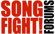
Spud wrote:[logo color]... Should be C60000
Care to enlighten us about the font settings for "SONG" and "FIGHT!" when placed one on top of the other?Spud wrote:If you study the original logo, you will see that the aspect ratio on the word "SONG" is different than the aspect ratio on the word "FIGHT!", in order to fit one over the other. This is part of what gives the logo its character (no pun intended).
Spud wrote:When you string the[m] out into one long line (which I do NOT prefer for this reason, among others) ... No solid rules here. Just make it look good.
Spud wrote:On the other hand, I am not saying that every time the words SONG FIGHT! appear in cover art, they should be in IMPACT at C60000. Use your judgement. Often, that would just not work with the art, and that's fine.


